5 Conference Room Colors that Will Inspire Employees and Customers

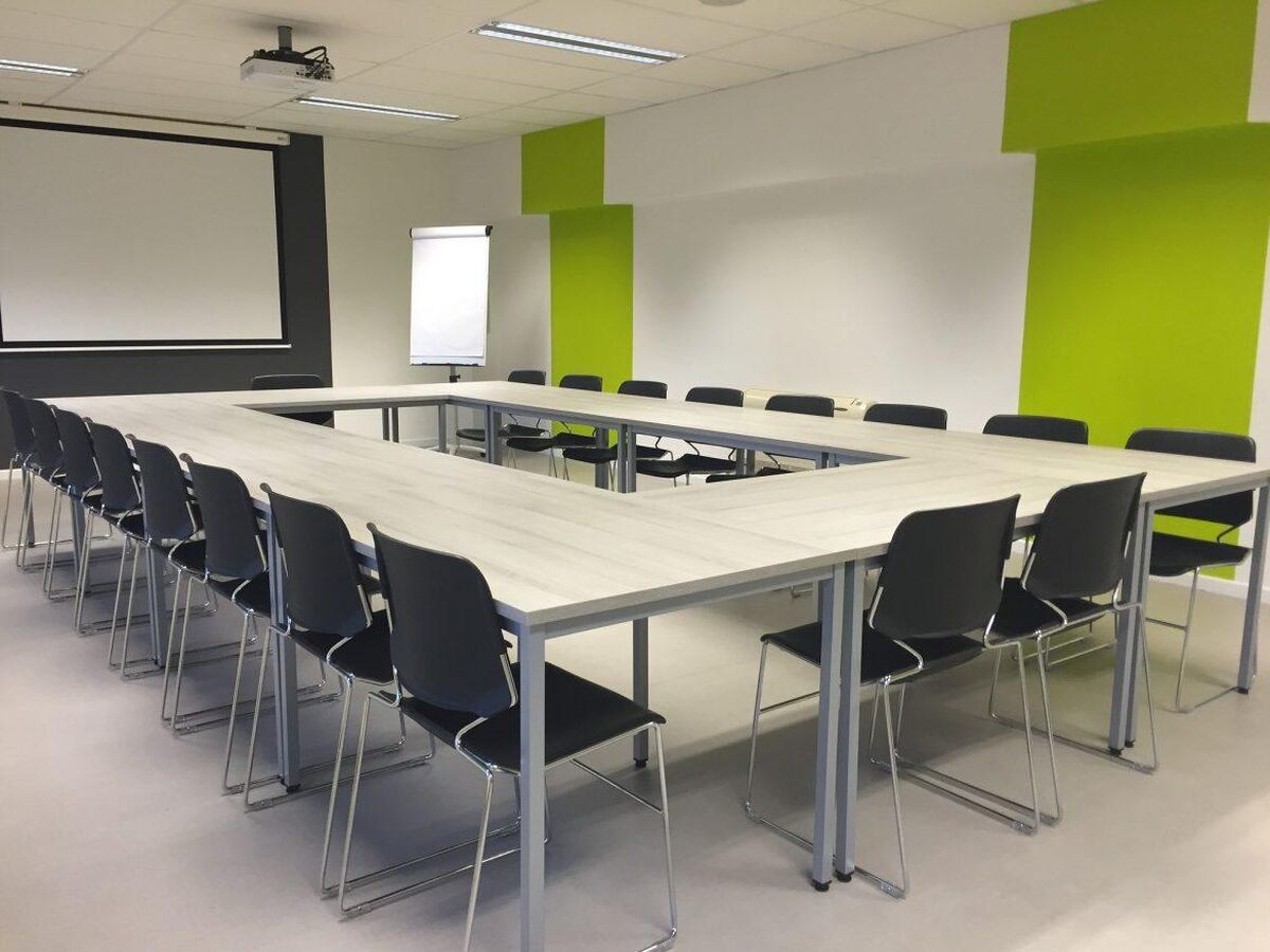
Conference rooms are often depicted as sterile, uncomfortable spaces that exude seriousness. It might not be so bad in the real world, but many conference rooms could use an update. Recent workplace trends see companies focusing on comfort and color to boost morale and increase productivity. Indeed, comfort has become all the more important in an increasingly remote workforce. When people are used to the relaxed nature of their home office, returning to a stuffy conference room can feel jarring.
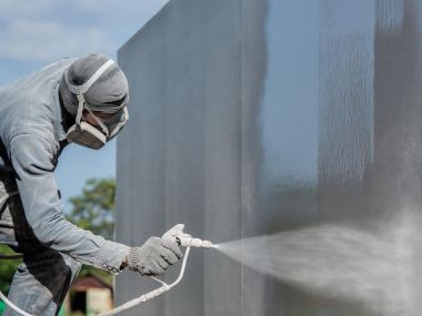
If your conference room needs a new look, it might be time to hire a Raleigh painting company. Here are five colors that will inspire employees and customers.
1. Blue
Most of us associate the color blue with clear open skies and calming waters. Of course, different shades of blue may elicit different responses. Darker blues feel more intimate, bringing the team closer together. Lighter shades burst the room wide open, encouraging new ideas and potential. Overall, shades of blue make for a comforting, calming conference room. If you don’t want employees, clients, or customers to feel intimidated or tense, blue is a smart choice.
2. Green
If you want more vitality in your conference room, paint it green. The color of life, green is a natural energy booster. Your staff and customers will wake up when entering the conference room. Like any other color, different shades may produce different effects. Bright, vibrant greens will bring out the most in people, while darker shades may increase focus. The best shade for a conference room may be somewhere in between.
3. Orange
The color orange seems to press all the right buttons for a conference room. It’s lively, warm, and calming all at once. You’ll come across orange walls in many modern companies. It’s a striking yet familiar color that we associate with fresh fruit, sunlight, and richness. An orange conference room will make a lasting impression on customers and allow everyone to feel comfortable inside.
4. Yellow
Yellow is a natural mood booster. It’s hard to avoid feelings of elation when encountering this color of sunlight, dandelions, and tropical fruit. If you want to bring an air of positivity to your conferences, yellow is the best option. As a result, this color will also make for better client meetings. Just be careful about the saturation. If the shade is too extreme it can become off-putting over time. A lighter, pale yellow is usually enough.
5. Red
Painting your conference room red will make the boldest statement of all. Red can be risky, as it’s highly stimulating. This can either lead to immensely productive conversations or to combative arguments. To avoid such extremities, painting a room two colors with red being one of them is usually the best way to implement this powerful color. Doing so will add a sense of authority to your conference room without overpowering the atmosphere.
In the end, you have a lot of colors to choose from for your conference room. Be mindful of how certain colors affect human behavior and interaction. While the research isn’t conclusive yet, it’s apparent that certain colors are better than others. If you need help deciding, contact us at Anderson Painting. We won’t just help you choose a color, we’ll paint your conference room and make repairs as well.
Anderson Painting contractors are also experienced in power washing, drywall repair, carpentry, and popcorn ceiling removal. The Anderson Painting company guarantee ensures that we’ll value all of your requests and deliver the job in a timely manner. Request a free estimate today.